This three-part Q&A features insights from three employees who played key roles in the design of the new MeasureReady™ 155 I/V source as well as the new XIP (pronounced “zip”) platform, Lake Shore’s entirely-new instrument platform:
- Adam Porsch, technical project lead and embedded firmware developer on the project
- David Plaga, principal engineer responsible for implementing the XIP platform on the 155
- Dave Ghioldi, industrial designer and XIP user experience designer
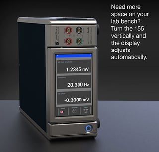
Talk about the 155’s touchscreen. What was the design process like for this feature? How did you take a lab instrument and make it as intuitive as a smartphone?
 Adam: Well, at the outset, we put much more of an emphasis on the user experience, the UX, and the user interface, the UI. We did this by leveraging the talents of our industrial designers and marketing groups, and combining that with the latest hardware and software designs that engineering brought to the table as options. Along the way, there were comprehensive and ongoing user tests developed and executed through the whole process—trying out new UI ideas, making changes, and repeating until we landed on the design we mutually agreed on.
David P.: I must admit, I was one of the few people on the team who was reluctant to change to a touchscreen. There are many more options with a full-color touchscreen display, and it is easy to get carried away and make a bad interface. I was glad to be part of the team to express my concerns to make sure we had an interface that was easy to use. For example, with a source, sometimes you want to control the amplitude or the frequency of the output while you’re measuring part of your circuitry. In this case, you are looking at an oscilloscope or meter and not the source. With the touchscreen, we implemented a “stepper” number entry mode which changes the entire display into a touch target. Settings can be incremented and decremented just by swiping up and down with an audible response confirming the action.
 Dave G.: That is a nice function, and when discussing the design process, I have to say, the team was granted great latitude to explore designs that fully utilize the strengths of a touchscreen. From the outset, each feature was optimized to exist natively on a touch interface. We quickly realized the benefits and opportunities afforded by direct interaction with on-screen content using gestures like touch and swipe. The information architecture and navigation were carefully constructed to exhibit clarity and extensibility. And to appeal to the widest audience, preference was given to platform-agnostic design patterns. Also, the interface was decluttered by implementing contextual screen content. Also, as Adam mentioned, there was a lot of user testing along the way. This testing provided feedback that was essential to the iteration and evolution of the design.
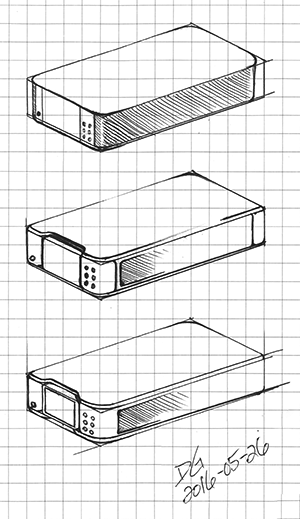
Speaking of user testing, the instrument has gone through some changes since the earliest design. Presumably, this was the result of feedback received from in-house engineers and scientists, as well as some trusted colleagues in the field who saw an early prototype. How were things modified based on the comments received and for what reasons?
 David P.: The instrument changed quite a bit during the design process. It was originally supposed to be a simple source, but we found out that we needed a few more advanced features to make it a valuable instrument. We also found that the noise floor of our instrument was better than we had expected and better than some of our competition, so we put a little more focus on exploiting that benefit. Getting the instrument in the hands of users is the best way to know if you are on the right track. Just observing how someone is interacting with it helps to make a better interface. No two people think the same way.
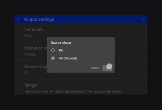
Dave G.: Yes, getting the unit into the hands of users is very important. It’s integral to our design process. Sometimes, the data gathered through user tests drives major changes to the design patterns. A good example is the addition of the quick access bar. In testing of an early prototype, we found that users would set all parameters visible on the home screen but not see the expected output on an oscilloscope. This was a result of the front and rear terminals setting. The issue was with the design, indicated by the fact it took users a long time to locate the setting that needed to be changed to see a signal on the oscilloscope. But once we knew, the design team recognized that we needed to improve our design. The solution was to add a quick access bar to the home screen, prominently displaying the current state of the control, the possible states, and providing quick access to selection of a different state. Other changes were more subtle but just as important, such as when user testing revealed unrecognized ambiguity. For example, with the source shape set to AC sinusoid, the title of the large value reported on the home screen was “Amplitude.” Testing revealed different users had different expectations of whether the value was reported in peak, peak to peak, or RMS. The solution was to include this information right in the title. Our XIP architecture and iterative design process enabled us to quickly implement and test this update, and verify that we had resolved the issue. These examples highlight how we learn, adapt, and evolve the design based on real data and user feedback.
Adam: Many times, you see instruments where it feels like the designers tried to put as much information on the screen as possible, creating an information overload experience for the user. Early on, we intended to have extremely simple screens. Still, there was feedback that it might be beneficial to have a bit more information on the main screens, like range selection and, as Dave pointed out, terminal selection on the main screens.
Look for Part 3 of the Q&A: Lake Shore firsts with the 155 and its low noise excitation capabilities

